

Wednesday, February 29, 2012

Saturday, February 25, 2012

Friday, February 24, 2012


Sunday, February 19, 2012

Saturday, February 18, 2012
Plug-ins I Frequently Use
I like to use a LOT of plug-ins that, from time to time, I either discover, or I am directed to, because they are compatible with Paint.Net. Most people do not know that there is a lovely plug-in created just for Paint.Net that allows you to actually add *8bF plug-ins to the program to enable you to use these extensions (which are what most pug-ins use). Click HERE to be directed to the Paint.Net forum that holds the needed plug-in.
Once you have downloaded it, unzip and add it to the effects folder of your Paint.Net program files. Then, visit the sites below and have fun!
Once you have downloaded it, unzip and add it to the effects folder of your Paint.Net program files. Then, visit the sites below and have fun!
ICNET Filters Unlimited
Xero Graphics Plugin-Ins
Greg's Filter Plug-Ins
The Plug-in Site
Mura Meister plugins
Visman Toolbox Plug-Ins
Toadies Plug-Ins
DSB Flux
PentaCom Plug-Ins
krusty's FX Plug-Ins
Lokas 3D Drop Shadow
Various Plug-Ins
Xero Graphics Plugin-Ins
Greg's Filter Plug-Ins
The Plug-in Site
Mura Meister plugins
Visman Toolbox Plug-Ins
Toadies Plug-Ins
DSB Flux
PentaCom Plug-Ins
krusty's FX Plug-Ins
Lokas 3D Drop Shadow
Various Plug-Ins
Flaming Pear
Tramages
Vanderlee Snowflakes
(other options available)
Mezzo Force Ice
(can cause program to crash)
Tramages
Vanderlee Snowflakes
(other options available)
Mezzo Force Ice
(can cause program to crash)
Wednesday, February 15, 2012
HOW TO: Use the Eraser
Using the eraser can be a really great tool when you need it. You can rid yourself of any excess material you don't want or blend one element in with another. I'm sure you don't need a tutorial on how to use the eraser so I'm just going to show you how to use it to blend.
First, this is my design that I have created just for this purpose. I have not DS any layers at this time.


First, this is my design that I have created just for this purpose. I have not DS any layers at this time.

The bridge is quite close but I want to make it look as if there is sand over it without adding another layer of sand. No problem!

Grab the eraser. I am using one on 95 and lower the brush hardness down to 13%.

I used circular strokes on the pier layer and this is what it looks like now.
Just like if you had been on the beach, with many beach-goers kicking up sand on the wood! You can do this for almost anything sitting on the sand as well.

HOW TO: Flatten an Image
Have you ever tried to save an image in PDN and have to go through all of this below:


From there, you know the show, right? *wink*
Well, stop going through all that! Simply do the following below:
Simple! Now, when you go to save, it doesn't do all the junk above. It just simply does the below:

Thank goodness I found this. Now I can stop doing it the other way! LOL
HOW TO: Double Drop Shadow a Frame
I have a tendency to make my frame look full on the inside, but with a good, tight drop shadow on the outside. I've have been asked about this and I will show you how I do that now.
I have created the cluster frame below to use in a signature tag. All of my elements are DS but not my frame. As you can tell, the frame paper and the frame look on the same level.


I have created the cluster frame below to use in a signature tag. All of my elements are DS but not my frame. As you can tell, the frame paper and the frame look on the same level.
In the layers box, find the frame and then duplicate the layer.

One the bottom frame, do a wide, light DS. I used 12-3-0-12-80. See how it pulled the frame away from the paper now. It looks as if you can place your fingers right down into it.

With a good sized eraser, swipe around the outside of the frame until you leave just the center as it is. Do not merge these layers.

Now, go to the upper frame and add a tight, dark DS. This time, I used 6-3-0-6-80.

As you can tell, now my outside looks good and dark but my inside looks much too dark for what I was trying to accomplish. So, take an eraser and swipe out the inside of the second frame.

Now my frame is light on the inside and dark on the outside, just how I like it!
Tuesday, February 14, 2012
HOW TO: Create an Avatar, Banner and Forum tags in Paint.Net
Depending on where you'd like to use your signature/banner will depend on the size of your design. Some forum banners/signatures will explain to you exactly what their size limits are so you should keep an eye it for that. Most scrapbooking banners are about 700 x 200, somce forum banners are about 600 x 250. For this tutorial, however, I am creating a banner/avatar that will be useable in CafeMom.
In CafeMom, there are two different sizes for forums and profiles. Profile signatures are 440 widths but can be found in almost any height. Fourm signatures are about 500 widths and can be any height but normally stop at about or around 500.
Avatars are also utilized in most forums, groups or websites and are sized about 150 x 150 or 200 x 200. Banners are normally 600 x 250.
To start, create the appropriate size canvas for your particular need. Since I will be creating a forum set (Avatar, Banner and Forum tag), I will create three different canvases in the three different sizes for my three different creations.
Follow the visual instructions seen below to create your three different canvases.

 Create each canvas and then save under a filename. Add your choice of elements, papers and tube (or not) when designing each one. My three are below (tube is by Jose Cano and kit by ButterflyDsign) .
My Avatar:
 As you can tell by my avatar, it is the smaller of the three and has very few elements, outside of the tube (making four elements). A simple initial in the background seals the deal. Never forget to add your copyright information when you have finished the overall look of your avatar. Just the name of the designer and your license will suffice.
My Banner:
 As you can tell with my banner, there is a higher useage of elements, along with my tube and border. The difference with the copyright here is that you must add not only the tube designer and license number, but the website of the designer as well. Your name, for some designers, is optional so read the TOUs of each designer before adding your name and copyright.
My Forum tag:
 This tag is a little more freeformed and I have created it a bit tighter since it is going to be on a profile and the widgets on CafeMom are restricted by size. How you place your elements and tube is all up to you.
Each element or tube is on a separate layer so that you will have to watch where you place them in your layers box. To learn about your layers box, go HERE. Having each element and your tube on a separate layer means a greater versatiliy for moving round and your drop shadow.
And now you have created your first forum set!
In CafeMom, there are two different sizes for forums and profiles. Profile signatures are 440 widths but can be found in almost any height. Fourm signatures are about 500 widths and can be any height but normally stop at about or around 500.
Avatars are also utilized in most forums, groups or websites and are sized about 150 x 150 or 200 x 200. Banners are normally 600 x 250.
To start, create the appropriate size canvas for your particular need. Since I will be creating a forum set (Avatar, Banner and Forum tag), I will create three different canvases in the three different sizes for my three different creations.
Follow the visual instructions seen below to create your three different canvases.
My Avatar:
My Banner:
My Forum tag:
Each element or tube is on a separate layer so that you will have to watch where you place them in your layers box. To learn about your layers box, go HERE. Having each element and your tube on a separate layer means a greater versatiliy for moving round and your drop shadow.
And now you have created your first forum set!
HOW TO: Add Non-Animated Glitter
I have shown you how to add animated glitter (noise) to any design HERE. I am now going to show you how to add non-animated glitter to a design for an added effect that does not require Animation Shop 3.
This is the design that I have created for this tutorial.
 I am going to add non-animated to the border and the white circle. This will help make your design pop.
I've highlighted the white circle in my layers box and then Effects > Noise > Add Noise > and a box will pop up. Set all three to what you like by moving them about and then hit ok.

 I've done the same thing with my border. After I have added noise (glitter) to both layers of my choosing, this is what my design now looks like.
 Since this design is non-animated, you can now straight upload to any widget and without an external link.
This is the design that I have created for this tutorial.

I've highlighted the white circle in my layers box and then Effects > Noise > Add Noise > and a box will pop up. Set all three to what you like by moving them about and then hit ok.

HOW TO: Create Animated Designs in Paint.Net
To create an animated design in Paint.Net requires just a bit more work then if you were using Corel PSP (or any other design program) but it can still be accomplished with a bit of patience. Once you get the hang of it, believe me, it becomes second nature and does get much easier with practice.
For animated designs in Paint.Net, you will need the standalone program called Animation Shop 3, which I purchased but have been recently told that you can get this program for free (but unsure as to where). Since it is a standalone program, it is also used by Corel PSP designers.
I am doing a simple glitter frame (and name) for this tutorial just to show you the basics of how to add a Paint.Net noise and how to add images to Animation Shop 3 (and back again).
Here is my main design, without a name or border. This free-to-use tube is by Brandi Ashton and is no longer available.
 Go to Effects > Render > Border to create a border to your liking (you can choose thickness and style of line here). You can choose colours from your tube or overall design for the border. I am using two colours form my tube, a line thickness of 5 and a solid line style.
For my new addition below, I also added a linear gradient by Effects > ICNET > Filters Unlimited > Linear Waves > Apply > Ok. All because of the newly installed .8Bf filter we added a few tutorials ago!
 I've rotated my image to add my name on either side because I want to animated this as well as the border. At this point, I also want to duplicate both the name and the border so that I can achieve 4 layers each--three as a noise layer for the name and border, one for outlining and drop shadowing the lower name layer, and one for the drop shadow on the lower border. Since this is also the size that I am normally going to use, I added my copyright now.


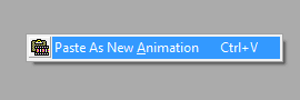
Open Animation Shop 3 to prepare for transferring your images (now called frames). Hide layers 2 and 3, and Edit > Select All > Copy Merged to grab your first frame layer and add to AS3.

 In AS3, right-click on the grey background and add your new animation.
 Go back into Paint.Net, check the first border and name layer, uncheck the second layers and repeat the process in AS3 but adding it behind the first frame you added.
 Right-click on your first image and then add behind the first frame image.
 Once all three frame layers are in AS3, add your optimization setting (tutorial HERE)and save. Congratulations! You have now created your first animated design in Paint.Net. You can safely save this design but it must be uploaded to a photo sharing site (like Photobucket or Fotki) to be able to use the animation. Otherwise, it will only look like glitter paint on a white background!

For animated designs in Paint.Net, you will need the standalone program called Animation Shop 3, which I purchased but have been recently told that you can get this program for free (but unsure as to where). Since it is a standalone program, it is also used by Corel PSP designers.
I am doing a simple glitter frame (and name) for this tutorial just to show you the basics of how to add a Paint.Net noise and how to add images to Animation Shop 3 (and back again).
Here is my main design, without a name or border. This free-to-use tube is by Brandi Ashton and is no longer available.
For my new addition below, I also added a linear gradient by Effects > ICNET > Filters Unlimited > Linear Waves > Apply > Ok. All because of the newly installed .8Bf filter we added a few tutorials ago!
Now I want to add my noise for my glitter effect to the top three layers of both my border and name. This is easy since noise is a permanent plugin in Paint.Net. You can also use DSB Flux Noise as well if you have this plugin.
Effects > Add Noise > and use the sliders or the boxes to add your effect. If you wish to use my numbers, I used 35/50/75 on border one and then simply upped the intensity by 10 for the subsequent layers.


You can also safely save the original design in Paint.Net, as this is a simple glitter design. You do not have to have to re-insert the frames from Animation Shop 3 to Paint.Net but that is not always the same for other animated design.
You can learn how to transfer animated designs from Animation Shop 3 back to Paint.Net HERE.
HOW TO: Use More Than One Kit in a Blog Train
I just recently posted a tutorial where I used two separate kits of a blog train to create a design and was asked "Is there and easier way instead of going back and forth between two kits?" Of course.
I download my two kits and save them in a separate folder (called "Supplies") in my design folder.

I save the original files but then copy and paste both files into one folder title "Combine". As I go through my tutorial, I can easily name what I am using because the file names are NOT changed at all!
Once I have completed my tutorial, I simply delete the combine folder and keep the original ones safely with the tutorial!
I download my two kits and save them in a separate folder (called "Supplies") in my design folder.
I save the original files but then copy and paste both files into one folder title "Combine". As I go through my tutorial, I can easily name what I am using because the file names are NOT changed at all!
Once I have completed my tutorial, I simply delete the combine folder and keep the original ones safely with the tutorial!
HOW TO: Rotate Images Or Text
Rotating images or text can be very easy. Only ONE pointer: if, when rotating your image or text, it becomes blurry (as it sometimes does), sharpening your image will help clear it up.
Open your program. Normally, it pops up with a blank, white canvas. This is fine for my tutorial.
 Add the element of choice and rid yourself of the addition frames. Edit > Deselect.
 While making sure my turtle layer is highlighted in my layers box, I'll go to the upper toolbar, locate layers and do the following:
 When the box pops up, you'll see lots of bells and whistles. Each one has a function and I will go over a few here.
"Pan" BUTTON: What the Pan button does is move your image on your canvas to whatever location the cursor is moved. The sliders with the Pan option will move the element up or down on the canvas.

"Roll/Rotate" BAR: Roll/Rotate moves your image in a circular motion around the canvas. When I used the second slider, it moves it it different "in and out" type movements. However, the third slider turns the image around


♥ Let's begin! ♥
Open your program. Normally, it pops up with a blank, white canvas. This is fine for my tutorial.


"TILING" Option: Does exactly what is says it does; it tiles like Mura Meister's Copies plugin. I had to move the "zoom" option out a bit so that you could see how it tiles your image.

"Zoom" OPTION: this is a great option if you need more than one, need the image larger, or need the image smaller. I used it above to highlight the tiling option for better viewing without having to create a larger canvas.

These options can be used for images or text when designing.
Subscribe to:
Posts (Atom)